Introduction
Let's start the configuration by tailoring the application to the brand identity, now that you upgraded the application. Branding the application can be helpful for various reasons. For instance, to indicate that the application is approved, what can be helpful for faster adoption. And the more often colleagues start using the application the more value it will offer to all. Because the value of the application is in knowledge sharing, in increasing accessibility of documents, applications and people.
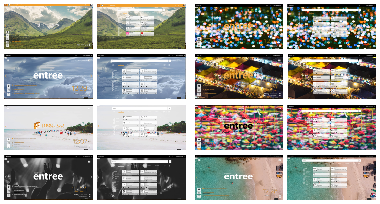
Though branding may appear simple and choosing images, logo and colors may seem trivial; your choices will have great impact. Below some examples of entree with different background images, logos and colors. And even though it is subjective how you feel about the images, I am pretty sure your preference goes to the left part of the image rather than the right. where the text and tiles are still somewhat readable.
Let's start with the look and feel of the product. In this article the focus in on the visuals of the application. Afterwards you can further tailor the look and feel of the application with the settings of home (which widgets, what order), the feed and the view of the hub.
Linkable images and logos
To keep the application light and agile, pictures and logos are 'linked to' and not actually uploaded into the application. This means that there are little to no size restrictions, so you can use high quality pictures that will look good, despite the size of the device used to enter the application.
It is important that images are not restricted, so they can be visible to all visitors of the applications. You can ensure this by:
- choosing one of the images of the entree collection, which will grow over time.
- uploading an image in the application via the SharePoint site asset library. Everyone who has access to the application, has access to the site asset library and will be able to see images that are stored there. Go to 'site content' and choose 'site asset library' to get there. Then create a new folder, upload the image in there, and when visible in the list, right click the item and 'copy link'.
- linking to open stock photos, our favorite free stock photo recourse is Unsplash. Find a (free) stock photo via one of these sites with beautiful good quality stock photos and copy the image url (right click on the image and choose 'copy image url').
- if you link to other locations, for instance your OneDrive, Drive, Dropbox, Box, iCloud or other cloud services provider, make sure that the settings are set to 'public'.
- Should you link to an existing external website the image should be visible (given it is visible without having to log onto the website, so be careful with pictures posted in social media).
Background image
There are a few things to keep in mind when choosing a background image for the application. Make sure the image you choose is not to crowded, or colourful, especially in the area of the widgets and or filters. This may limit the usability of the application as you may have noticed in the image above.
Increase user engagement by adjusting the image to holidays, seasonal activities, company events and or campaigns. It show that it is not a static tool, but one that follows the (activities) of the organisation.
Logo
Logo's are given with little choice. Or so it appears. Often there are multiple versions of the logo with or without background, sometimes in different colours. As the Marketing department for the options. Knowing your options may help find the perfect balance between your logo and the background image. You can also choose not to display a logo.
If you do display a logo, you can choose the height of the logo. We advice a height of 200, but depending on your logo (and/or background) you may choose differently. Again the location of the logo is important, it should be published via a location that is not restricted. Ask your marketing department if there is such a link on the website, and otherwise upload it in the website.
Colours
Choose your colours carefully. Of course the official colours of the brand identity are a good starting point. Sometimes these may not work with your chosen background image. Make use of tools such as Adobe's colour wheel to find out what colours work together. You can also upload a picture to
Adobe's colour wheel, for it to choose the colours.
In the image below a visualisation of which colours can be adjusted.

NB: the colour of the clock is set via a different part of the admin panel. You can find that under home configurations.
Was this article helpful?
That’s Great!
Thank you for your feedback
Sorry! We couldn't be helpful
Thank you for your feedback
Feedback sent
We appreciate your effort and will try to fix the article